Is this the era where bloated, multi-page websites come to an end? Maybe. What’s clear to me is that businesses are shifting toward leaner, more profitable website strategies that prioritize speed to market, message-market fit, and clear-cut ROI.
Meet the one page website—a conversion-focused landing page strategy that’s helping startups, founders, and early entrepreneurs to grab people’s attention and convert them ASAP. When done right, any business can launch a single, high-converting website built for revenue growth from the get-go.
But like any good strategy, success comes down to execution. In this case, that means structuring your one page website with the right sections—each working together to guide visitors from first click to final action.
This guide breaks down the five must-have sections that make a one-pager and a landing page strategy successful.
1. Hero Section: Capture Attention in Seconds
Your hero section makes or breaks your landing page strategy. If you don’t hook visitors in seconds, they’ll leave. So communicate your offer clearly, quickly, and persuasively.
Sadly, most businesses get this wrong. They open with vague, feel-good statements or self-indulgent introductions that don’t say anything useful. Your hero section isn’t about you—it’s about what your visitor wants.
What This Section Needs:
- A clear, outcome-driven headline – Instantly communicate what you do and why it matters.
- A concise sub-headline – Reinforce the core benefit of your offer.
- A strong call-to-action (CTA) – Guide visitors toward the next step immediately.
- (Optional) A supporting visual – A product mockup, a credibility marker, or a simple image that reinforces your message.
Good vs. Bad Hero Sections:
- Weak: “Welcome to [Brand Name]! We’re passionate about helping businesses grow.” (Too vague, doesn’t address a problem.)
- Strong: “Get a high-converting website built in 7 days—so you can start making money faster.” (Clear, compelling, outcome-driven.)
Your hero section sets the tone and expectations for your one page website. If it’s weak, the rest won’t matter, and you can expect high bounce rates as your ROI.
2. Trust Section(s): Show Proof, Fast
People don’t buy from strangers—they buy from businesses they trust. If visitors don’t trust you, they won’t buy from you. It’s that simple.
So, your trust sections exist to remove doubt and establish credibility instantly by providing layered proof throughout the page.
The best landing page strategies don’t rely on just one trust signal. They strategically place multiple layers of proof where visitors need them most. Here’s how:
2.1. Logo Trust Bar for Instant Credibility
Before visitors even read a word, they should see immediate proof that you’re legitimate. This is where client logos, media mentions, or strategic partnerships work best.
Example Layout:
- A clean row of client logos, press features, or industry partnerships.
- Use logos of well-known brands or recognizable industry names.
- If applicable, pair logos with outcome-driven proof (e.g., “[Client Name] increased conversions by 37% in 90 days.”).
For example, here’s a concept I pitched for a client’s SEO Services landing page strategy when I was hired to deliver conversion-focused copy. Instead of just dropping logos, I structured it to highlight real-world results, making their proof instantly more compelling.
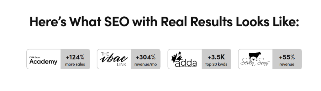
By the way, client loved this approach so much that they implemented it across other landing pages, reinforcing that trust is earned, not assumed.
2.2. Testimonial Placement to Reinforce Key Moments
A randomly placed testimonial section does not contribute to a good landing page strategy. Instead, you need to strategically place testimonials to eliminate hesitation and move visitors toward action.
Why? Because well-placed proof reassures visitors at the exact moment doubt might creep in.
Best placements for testimonials:
- Near a CTA – Reinforce action with proof of success.
- Below the offer breakdown – Support the claims being made.
- After addressing a major pain point – Show that others had the same problem and solved it with your service.
- Before or after a pricing section – Justify the investment by showing ROI.
- Right before the footer – A final push to convert hesitant visitors.
How to Make Testimonials More Persuasive:
- Make them specific – Avoid vague praise like “Great service!” Instead, focus on real outcomes tied to your core offering (“Within 30 days, our conversion rate increased by 47% after launching our one page website.”).
- Infuse relevant keywords – A well-written testimonial naturally includes keywords that matter for SEO. If your service is one page websites for startups, a strong testimonial might say: “As a startup, we needed a high-converting one page website fast. Within a week, we were generating leads.”
- Match the wording to surrounding sections – Testimonials should reinforce what’s on the page. If it’s near pricing, have a value-driven quote (“Worth every penny—this website paid for itself in the first month!”). If it’s near the CTA, make it action-driven (“I was hesitant, but I took the leap—and it was the best business decision I made this year.”).
- Use a full name and company (if possible) – Real names add legitimacy. Bonus points if the company is recognizable or the person holds a high-value title (Founder, CEO, Marketing Director).
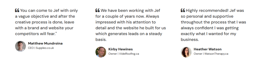
Here’s how I style my testimonials for my multi-page web design services:
Remember, a testimonial isn’t just a nice thing said about your business—it’s a conversion tool. If done right, it reinforces your message, removes objections, and can even boost your SEO.
3. Problem & Solution: Address Their Pain, Position Your Offer
Before you can sell, your visitors need to recognize their pain points. If they don’t recognize their pain points, they won’t see the need for your solution.
The mistake most businesses make? They skip straight to selling and talk about their offer.
Ew, stop that.
An effective landing page strategy starts by clearly addressing a pain point. If you can’t resonate with their struggles, they won’t take action. Here’s what you need to do to show visitors that you understand them better than they do.
How to Structure This Section
Start with a clear problem statement—something that makes your visitors think, “Yes, that’s exactly what I’m dealing with.” Then, transition into your solution, showing them exactly how your offer fixes the issue.
Example Format (for a B2B SaaS – CRM Software):
🔴 The Problem:
- Your sales team struggles with messy spreadsheets and lost leads.
- You have no clear view of your pipeline or deal progress.
- Following up with prospects takes too much manual effort.
✅ The Solution:
- A CRM that automates lead tracking and follow-ups.
- Real-time pipeline visibility to close deals faster.
- Integrates seamlessly with your existing tools—no extra work required.
When a prospect reads this, they should instantly feel seen and understood. The problem should sting just enough to make the solution feel like the obvious next step.
Want to Make This Section Even More Persuasive
- Use their exact language – Mirror how your audience talks about their struggles. If they say “I just need something simple that works,” say exactly that.
- Keep it scannable – Short sentences, bullet points, and direct wording keep readers engaged.
- Make the transition natural – The shift from problem to solution should feel obvious and seamless.
Once they see their pain laid out—and your solution answering every single point—it’s no longer a question of if they need it. It’s just a matter of when.
4. Offer Breakdown: What They Get, Why It Matters
Features tell, benefits sell—but neither work in isolation. A landing page strategy needs to connect the dots between what you offer and why it matters.
Your offer breakdown needs to connect the dots between what you deliver and why it actually matters to the buyer. Every feature should lead naturally into a real, tangible outcome.
- If your service includes automated workflows, say how that eliminates repetitive tasks and frees up hours each week.
- If you offer 1:1 strategy sessions, make it clear that this means personalized, high-impact guidance instead of a cookie-cutter plan.
When your offer is structured like this, prospects don’t just see what they’re getting—they see why it’s a no-brainer. No confusion. No hesitation. Just an easy yes.
The Right Offer for the Right People (ICP & Packaging)
Even the best offer will flop if it’s aimed at the wrong audience. A cold SaaS founder isn’t looking for the same solution as a solopreneur testing their first product.
This is why knowing your ICP (Ideal Customer Profile) is critical. Your offer should be so aligned with their needs that saying no feels like missing out.
- Who is your offer built for? A stressed-out business owner who needs results now? A scaling startup that needs automation?
- What pain are they actively trying to solve? Not just “growth” or “efficiency”—but the daily headaches that make them search for a fix.
- Why does your offer make their life easier? How does it save time, increase revenue, or remove uncertainty?
Your offer should be packaged to sell—like a kid selling lemonade outside of a church on a hot, sunny Sunday. The right people, the right moment, and the right message.
If your offer speaks directly to the right audience, price becomes an afterthought. They’ll see the value before they even ask for the cost.
A Note on Pricing
I’ll keep this brief because I’ve written extensively on how to pitch your prices for a one page website.
Your pricing isn’t just a number—it’s a filter. It sets the expectation for value, expertise, and commitment.
- If your pricing is vague, expect lowballers and tire-kickers.
- If your offer is too open-ended, you’ll waste time on dead-end leads.
- If your price isn’t positioned correctly, you’ll attract people who just want free advice.
A strong pricing strategy pre-qualifies leads before they ever contact you. It tells the right prospects, “This is for you,” while sending the wrong ones elsewhere—saving you time, energy, and frustration.
5. Contact / CTA: Simple, Actionable, and Next Step(s)
Your CTA is the easiest part of your one page website—seriously, don’t overthink it. You can slap a one- or three-word phrase in a button like “Buy,” “Download Now,” or “Book a Consult” and call it a day.
Visitors shouldn’t have to guess what to do next. The moment they’re convinced, the next step should be stupidly obvious. If your page does its job, a single, clear CTA is all you need—they’ll take action.
But if your offer has a higher complexity or commitment level, a dual CTA strategy might work better. This means giving them two paths forward:
- Primary CTA – The main action you want them to take (e.g., “Get Started” / “Schedule a Call” / “Apply Now”).
- Low-Risk or Free Entry Offer – A no-pressure way to engage, like a free resource, email list signup, or product demo.
This way, you capture both types of visitors—those ready to convert now and those who need a little more nurturing before making a decision.
Regardless of which approach you take, keep it simple, direct, and frictionless. Every second of doubt or confusion lowers your conversions. When a visitor reaches this section, the next move should feel as natural as scrolling down your one page website.
Why One Page Websites Are Taking Over in 2025
Honestly, I don’t believe this is the era where multi-page websites will die. But I do believe businesses are becoming more intentional about when and where a multi-page website makes sense.
For companies with multiple service lines, a long sales cycle, or an extensive content strategy, a multi-page website is exactly what you need. It allows for deeper engagement, SEO scalability, and a structured way to showcase complex offerings.
But not every business needs that level of complexity—especially those looking to move fast and generate revenue sooner.
For startups, founders, entrepreneurs, and freelancers who need to make money fast, a multi-page website isn’t always the best plan of action. When speed to market and early revenue wins matter, a one page website with a conversion-focused landing page strategy is the smarter play.
That’s why I offer one page websites—not as a replacement for multi-page sites, but as an alternative for businesses that need to launch fast and start selling faster.
Start small, Grow Big with a One Page Website by Jef van de Graaf™
Whether you’re testing message-market fit, validating an idea, or launching a new service, a one page website gives you the flexibility to pivot without insane overheads.
Here’s why you should use a one page website to help drive the results you want for the business you’re about to start:
- Speed to market – Get online in days, not months.
- Test message-market fit – Launch quickly, gather insights, and adapt.
- Clear-cut ROI – Every section is built to drive every visitor to action.
- Cost-effective – No unnecessary pages, just a high-impact, conversion-focused structure.
- Hyper-focused – No distractions, just the right message for the right audience.
If you’re ready to launch a one page website that helps you make money faster, apply for yours today!`